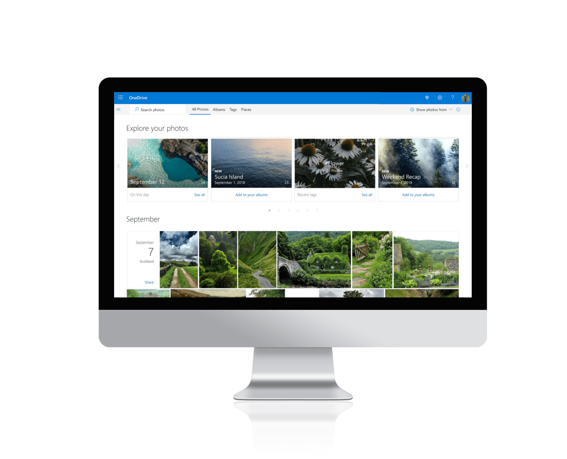
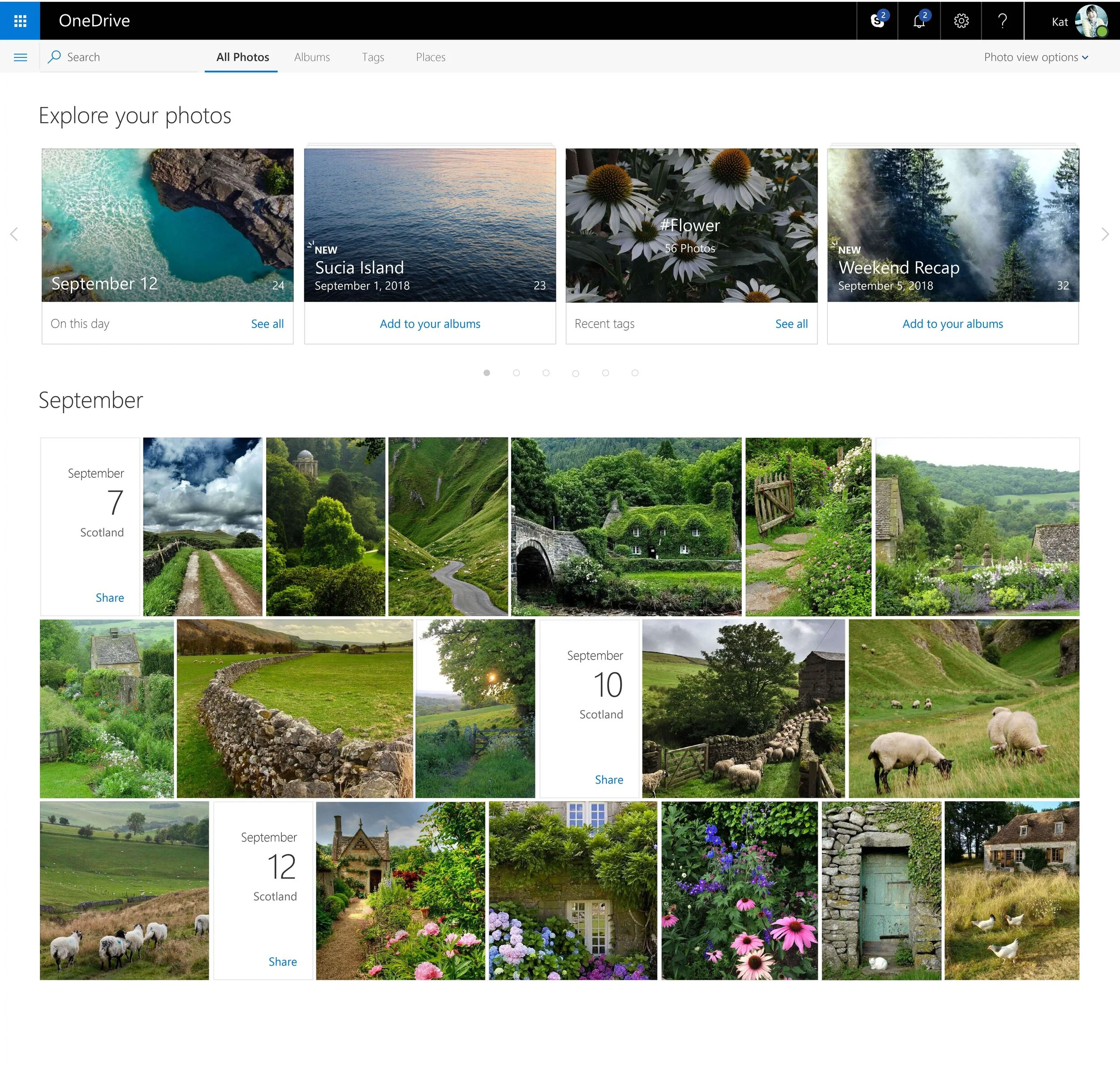
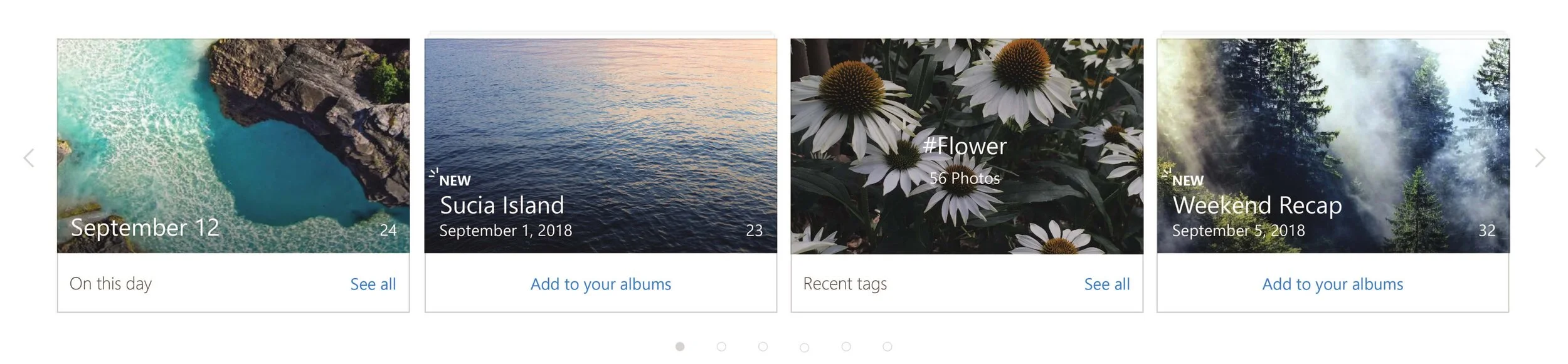
Explore your Photos Banner Design
Album Thumbnail Designs
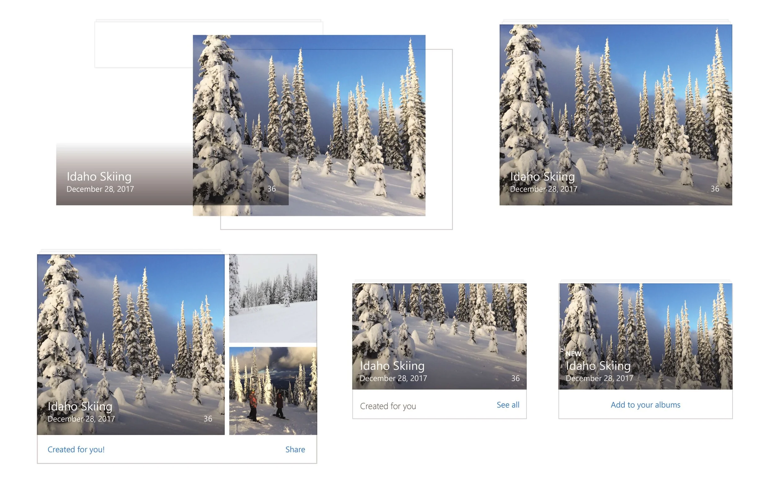
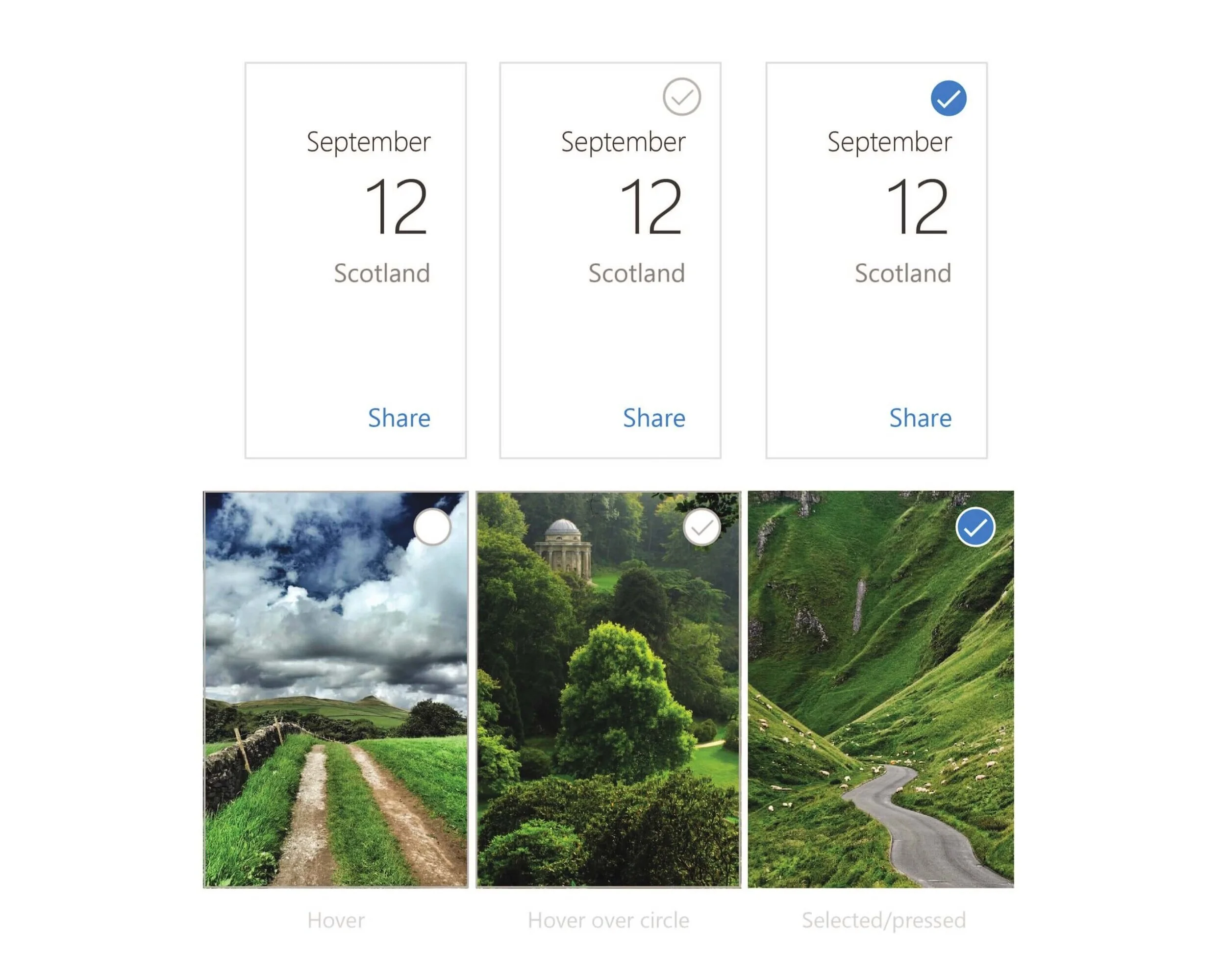
Date Card Selection States
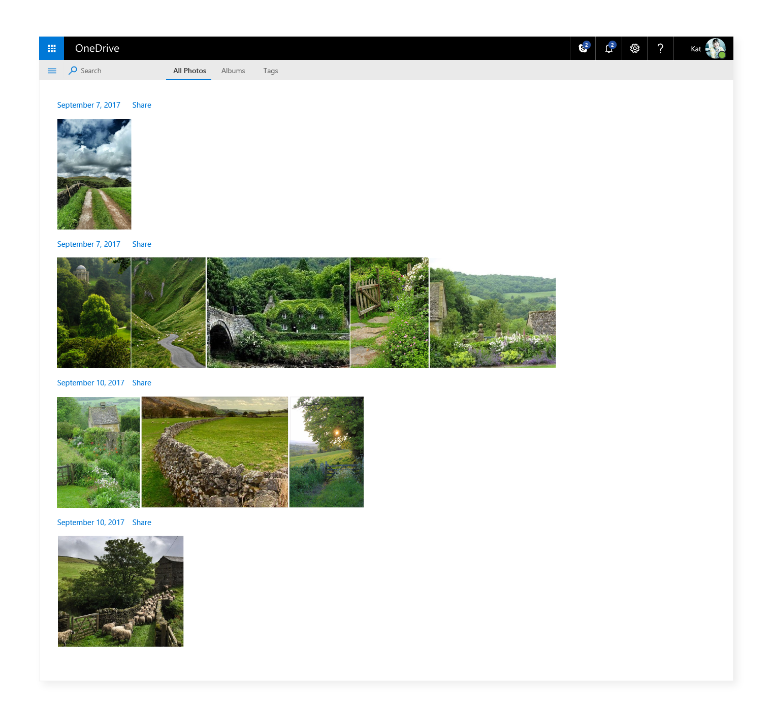
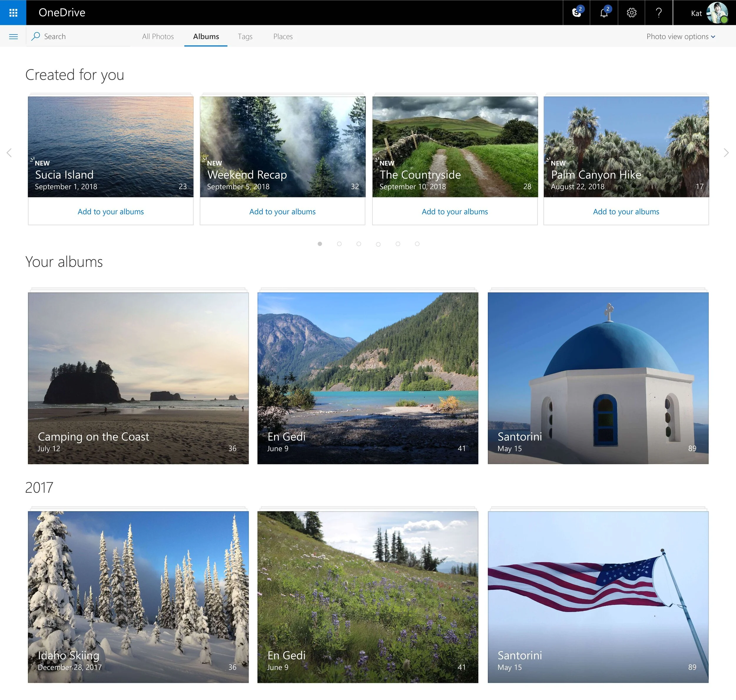
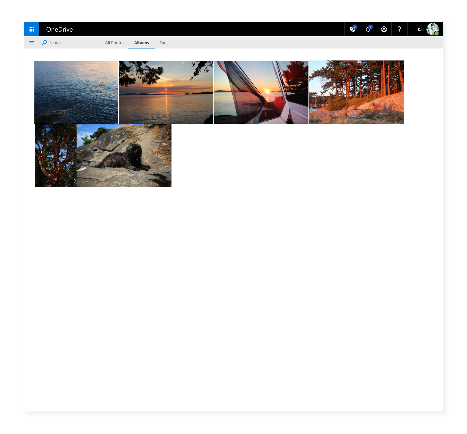
Album View
The Album View followed the layout from the All Photos view by making use of the screen space and by showcasing the user’s content in an immersive, organized layout.
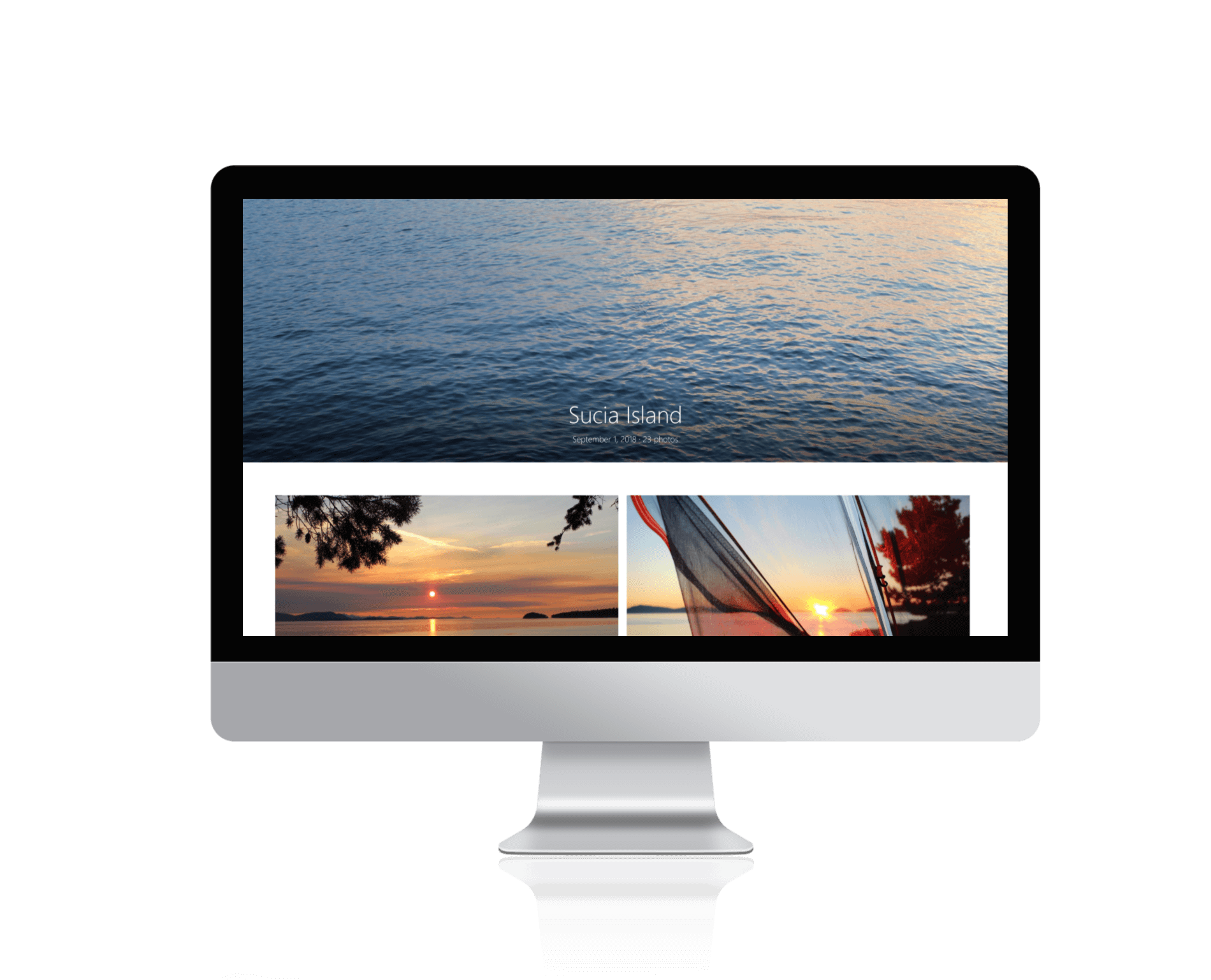
Single Album View
The Single Album View utilizes a hero image at the top of the page, acting as a cover or main photo for the album. This creates an immersive experience for the viewer. The rest of the design uses white space to frame every photo. I was inspired by old paper photo albums which always have plenty of space on each page. The album title text is center aligned to lead the eye towards the center of the design. By centering the text, it creates a balanced composition that feels special and different from the album thumbnails and other views. The use of a gradient behind the title allows for the text to lay over the photo, while still being accessible.

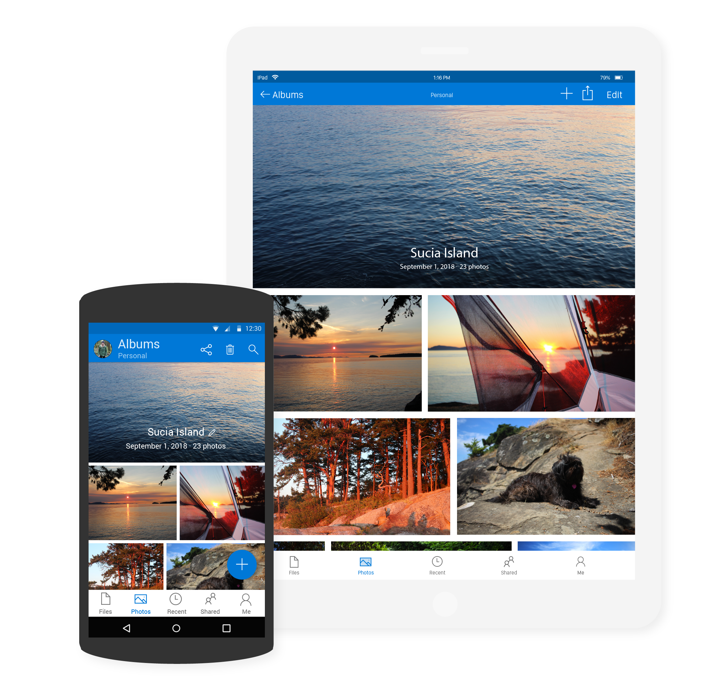
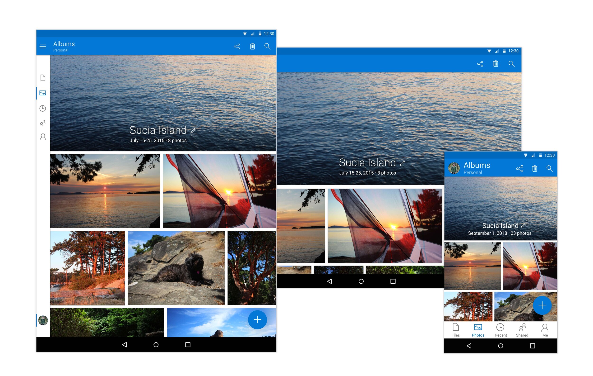
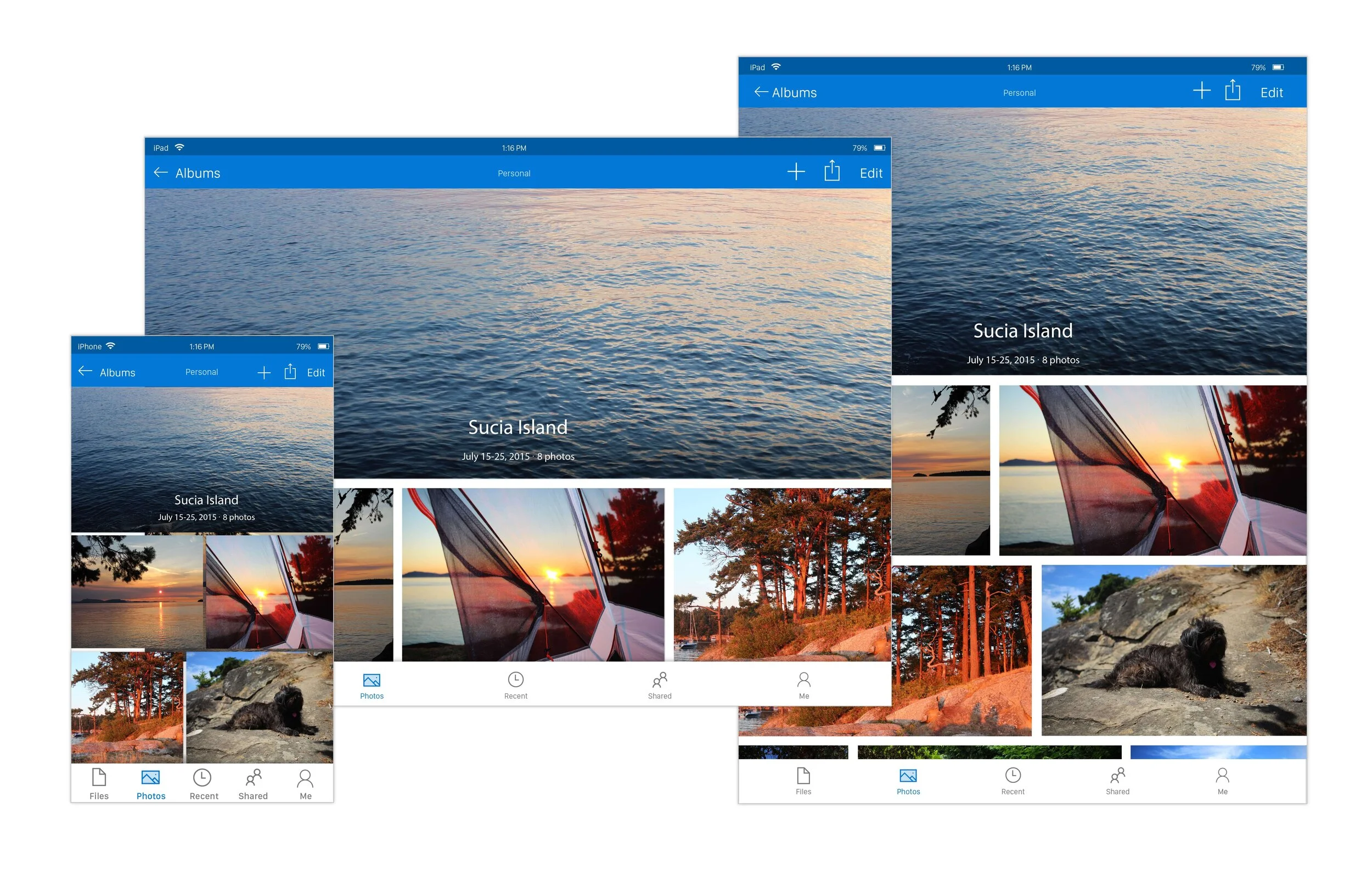
Tablet & Mobile
Android & iOS Designs
Mobile and tablet designs were created, and they mirrored the web as closely as possible. I worked with the mobile developers to capture every detail of the designs. The mobile apps took much longer and had to be developed in stages before their current state because of many technical restrictions.
By doing this project, I learned the design guidelines of iOS and Android very well, which helped in other projects in the future. Each platform has their own type system, colors, selection states and UX. These factors influenced the final deigns and in the end they showcase a seamless and harmonious photos experience no matter what device is being used.