
Designing Atlassian's People: A Scalable Character Illustration System
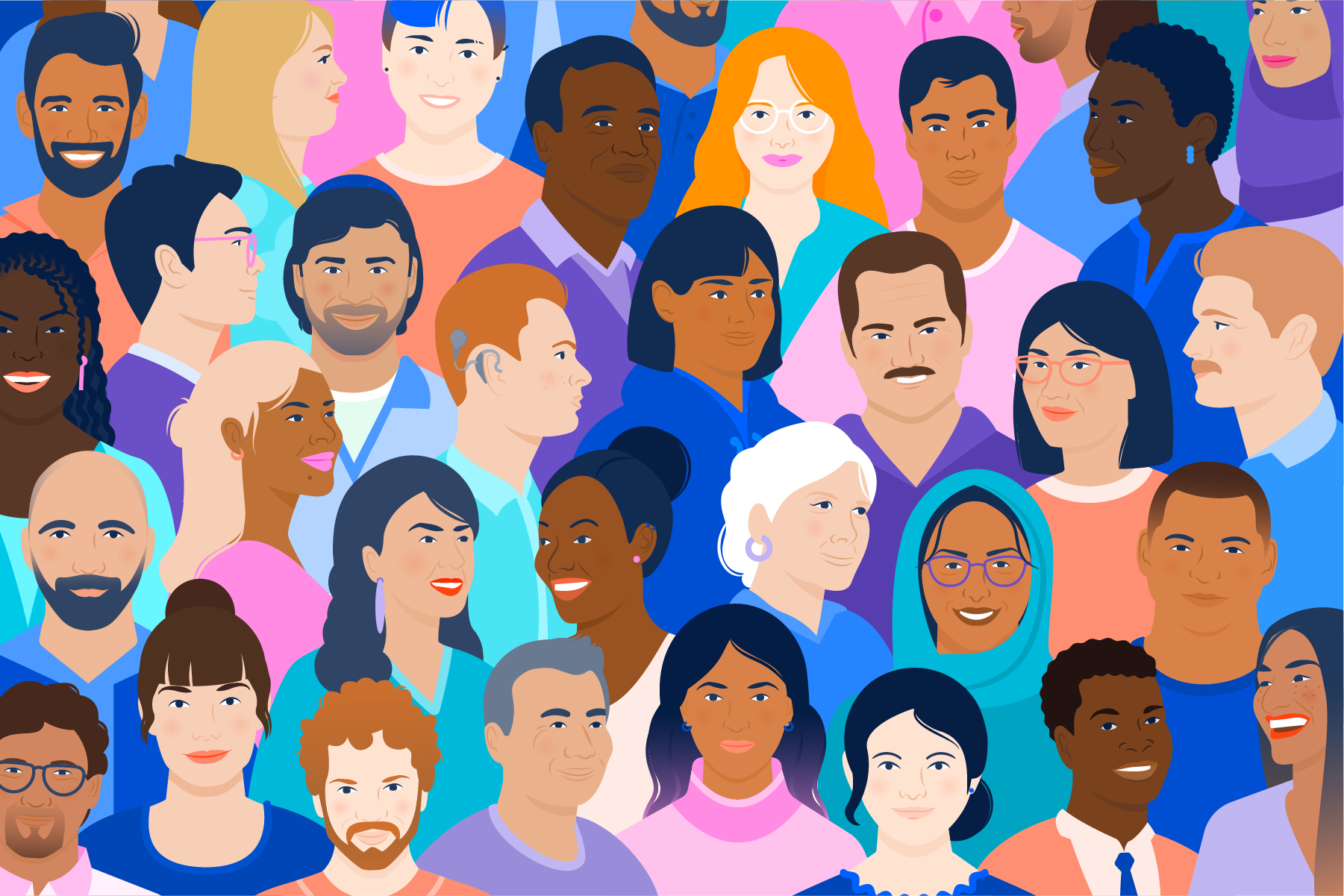
Atlassian's illustrations had evolved into rich scenes of characters interacting — bringing diversity, inclusion, and teamwork to life in every composition. In early 2022, I helped lead a full overhaul of the people illustration library, replacing simple geometric characters with a collection inspired by real people of distinct ages, body types, and races. The updated system includes character sets with multiple views, simplified monochromatic avatars, and fully articulated figures in dynamic poses — all built for flexibility so they can be easily adapted for new compositions and animation across product marketing, social media, print, and web.
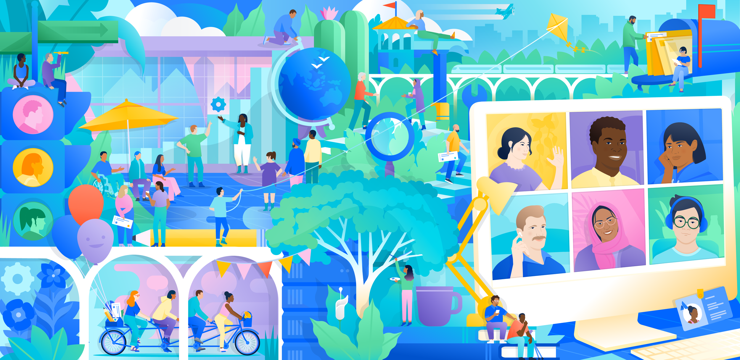

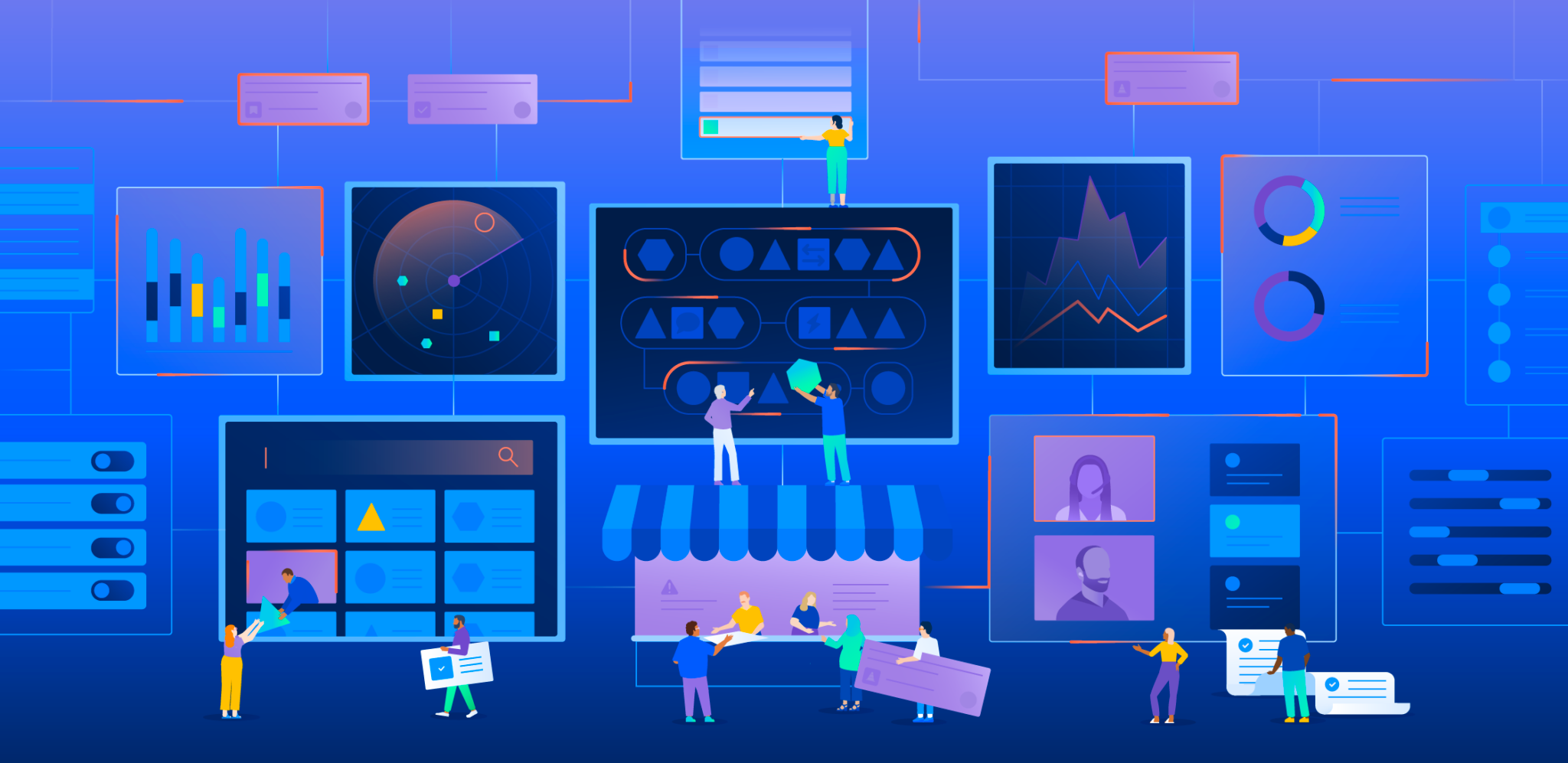
Home page hero illustration for Atlassian.com
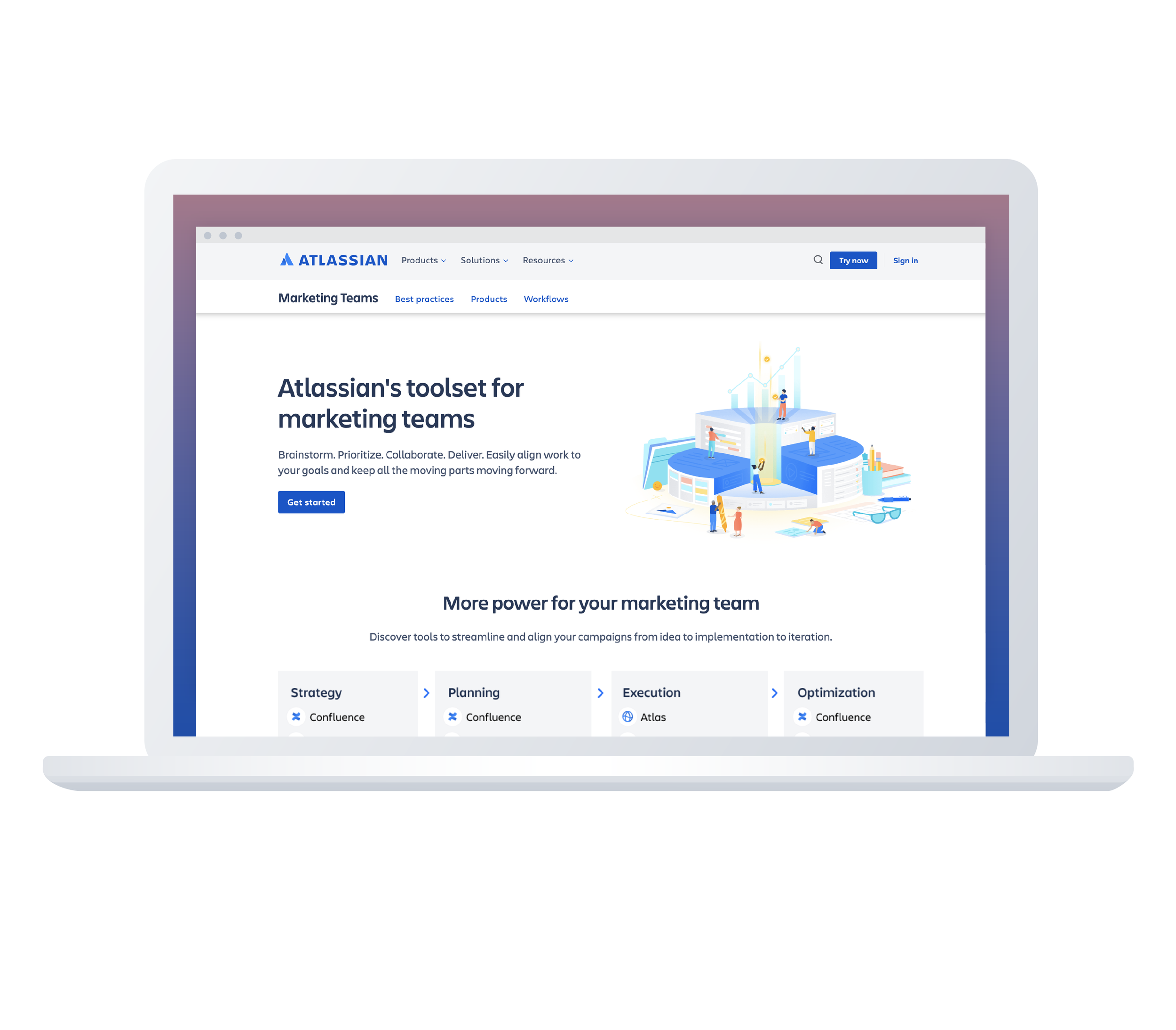
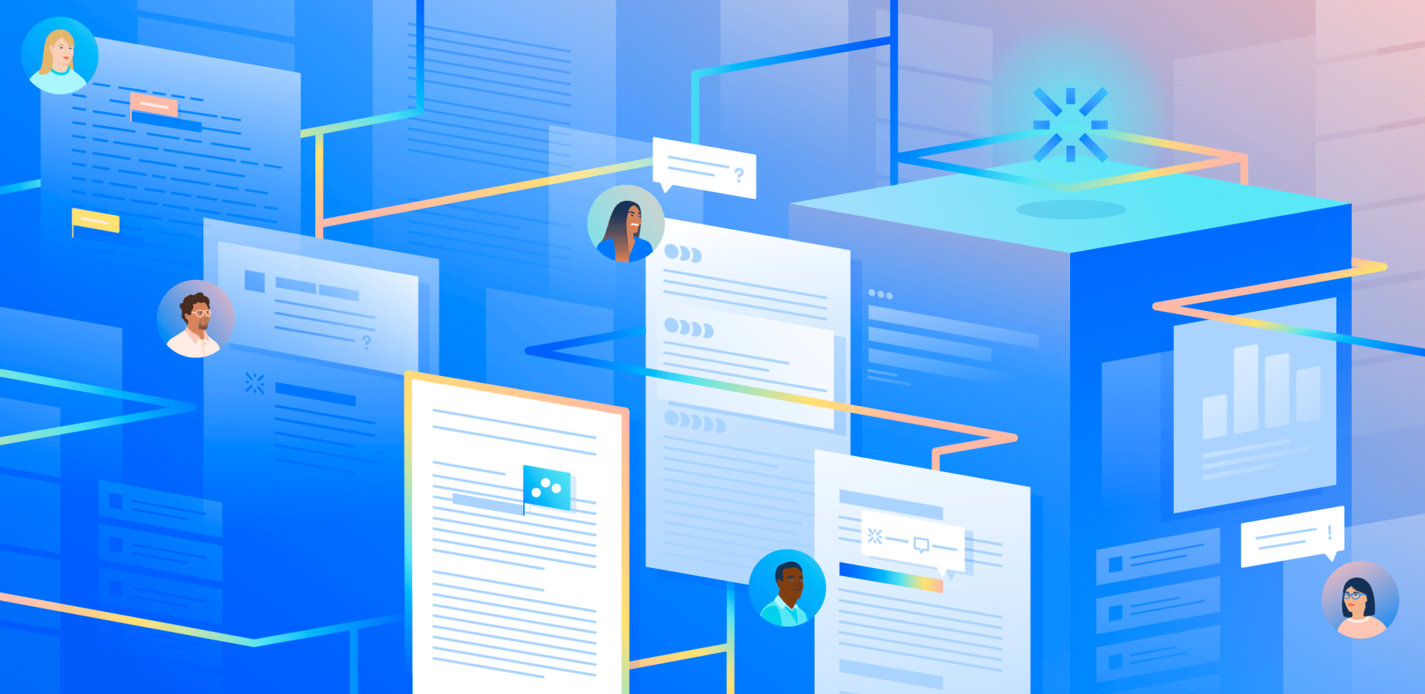
Hero Illustration for Marketing Teams
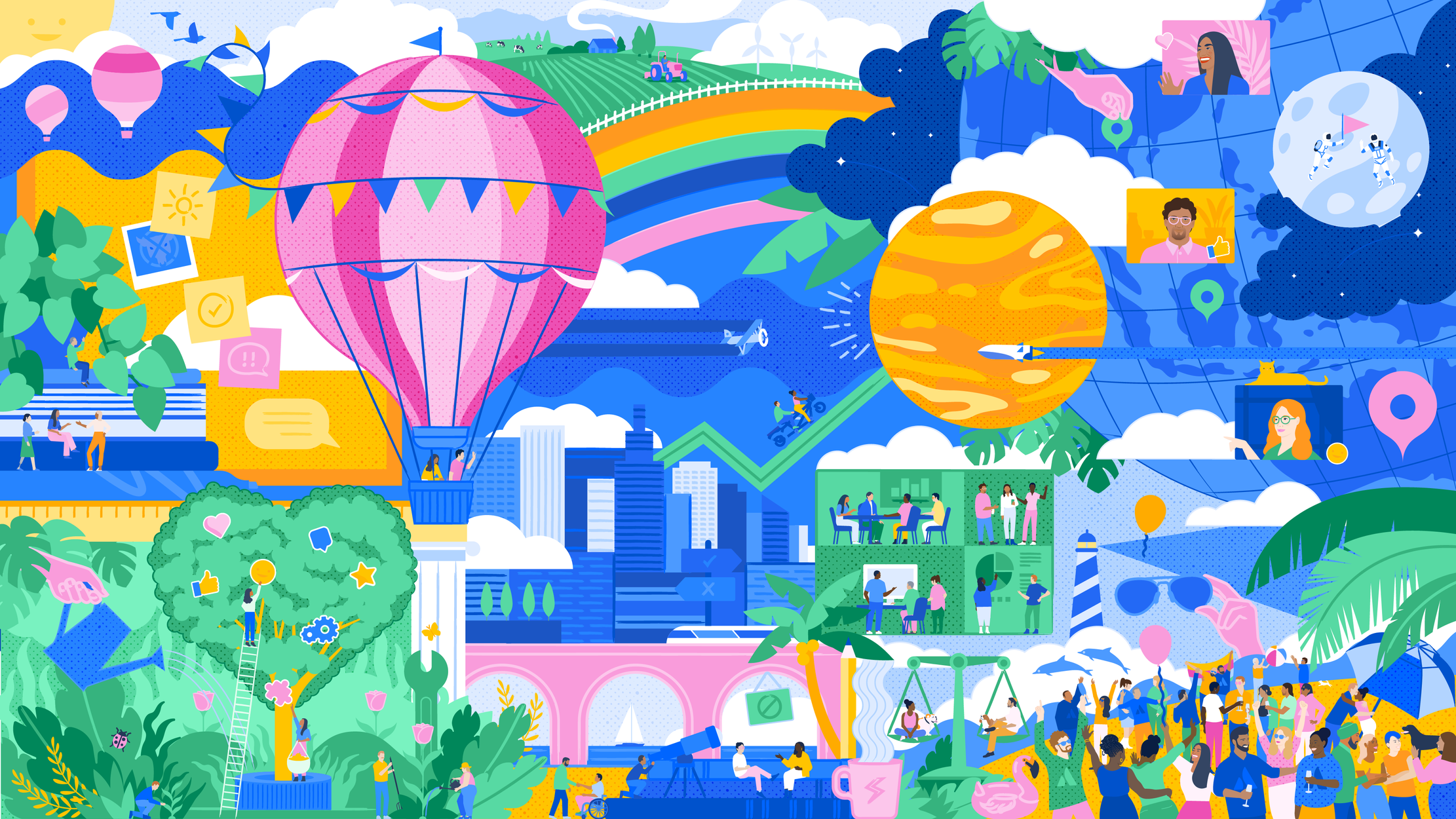
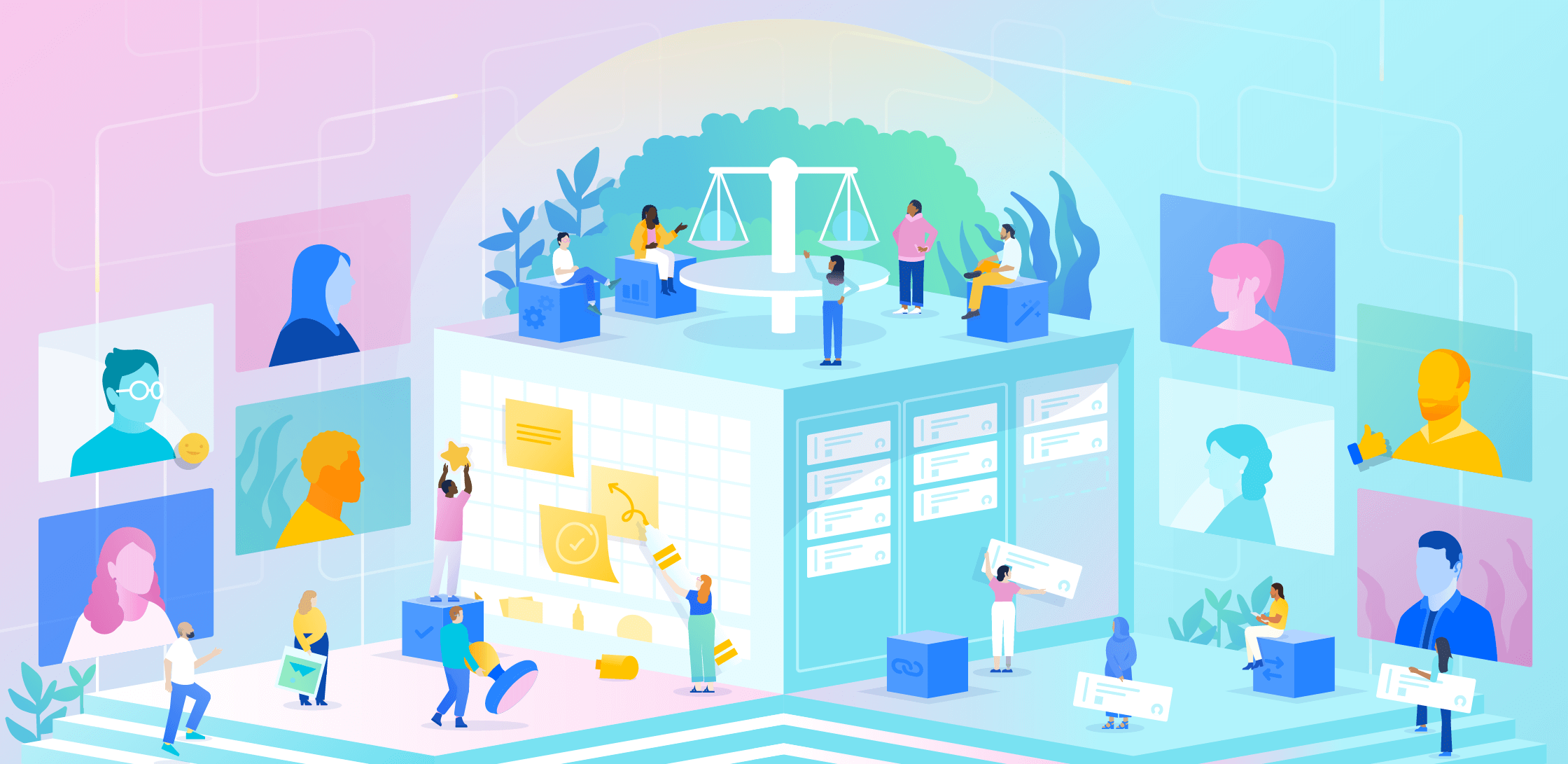
Atlassian’s new employee Welcome Kit includes this printed illustration.
Cover of Atlassian’s Q2 2023 Shareholder Letter
Cover of Atlassian’s Q3 2023 Shareholder Letter
Cover of Atlassian’s Q1 2023 Shareholder Letter
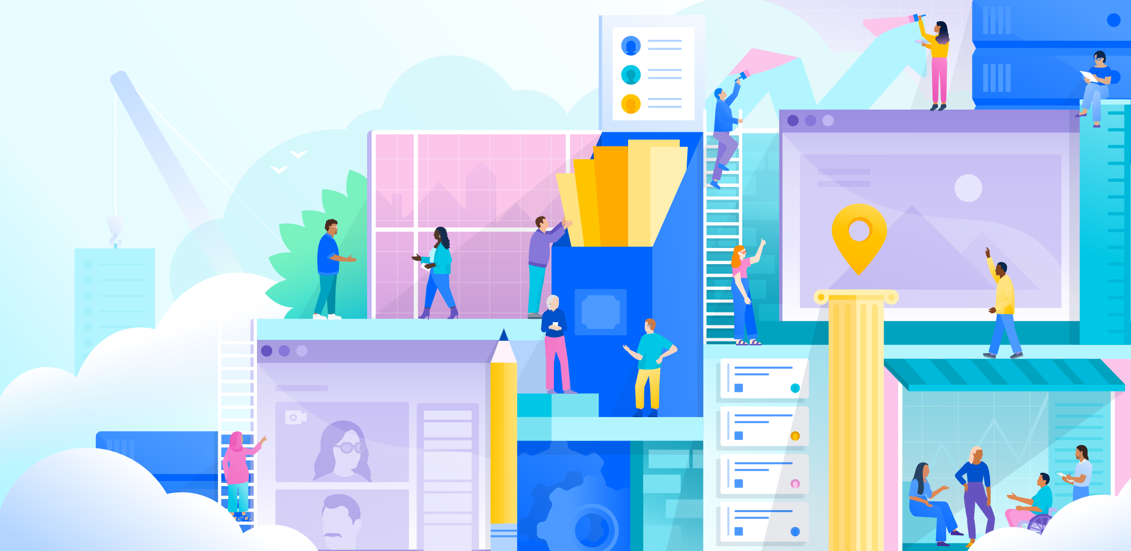
Cover of Atlassian’s Q2 2022 Shareholder Letter