

Blocking Dialog Iterations

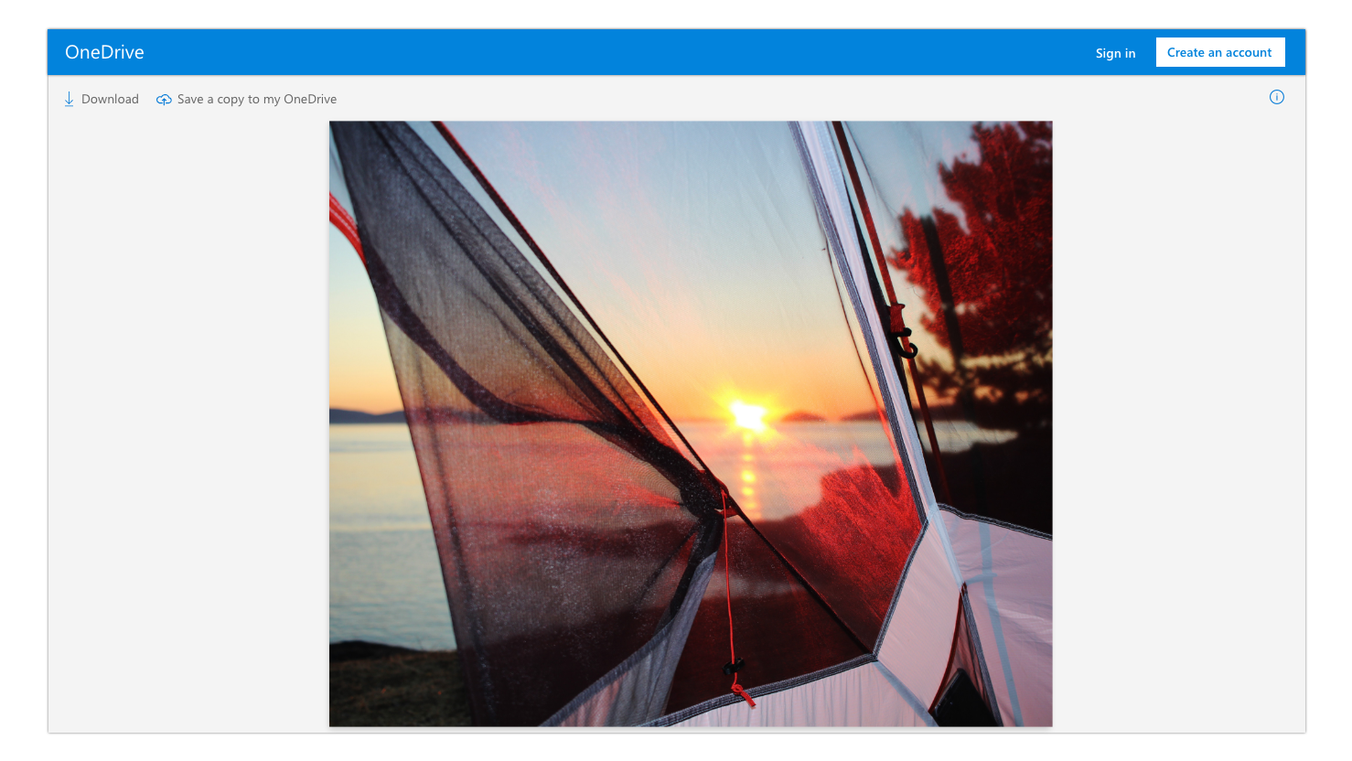
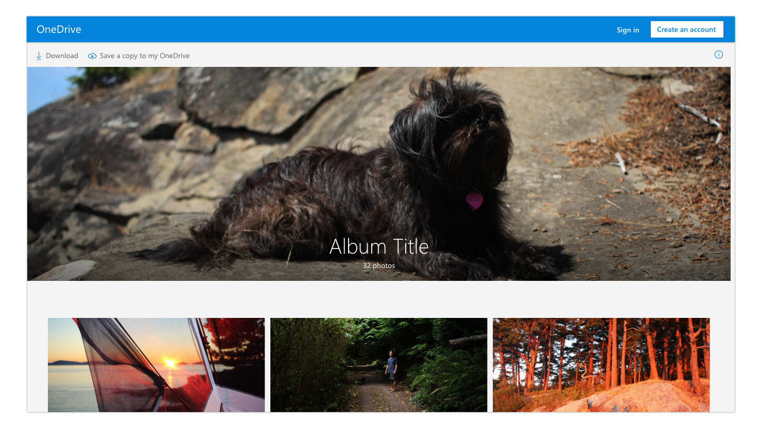
The process started by displaying OneDrive’s presence with a blue bar at the top of the page. I added the options to sign in or to create an account (with more prominence), to encourage users to make a decision.

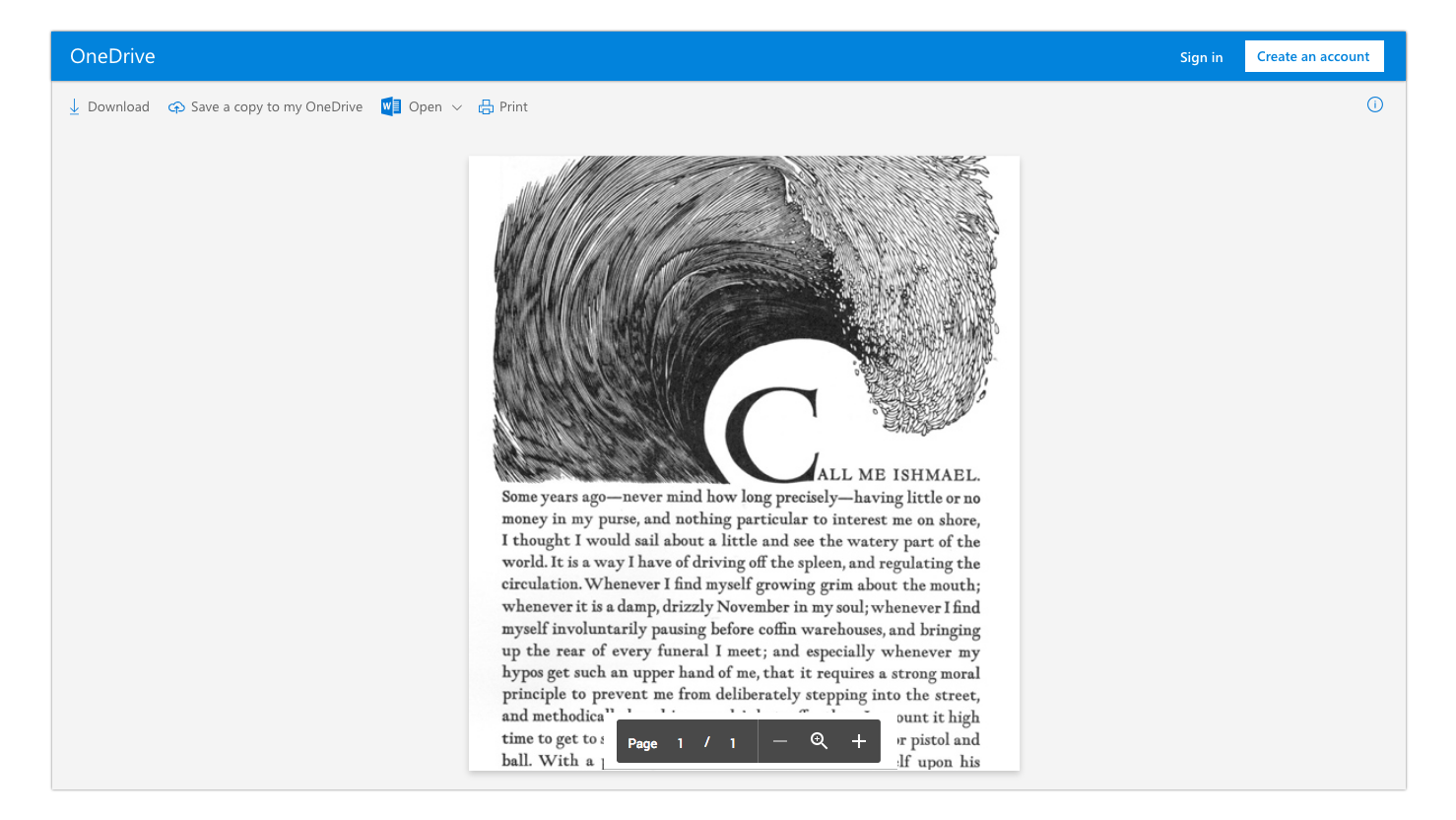
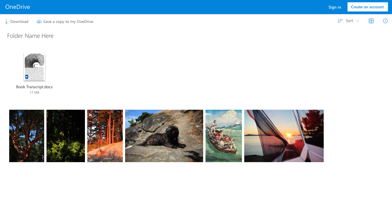
Next, I determined which commands were appropriate to show for each different file type. At the time, every command was present, so I investigated whether or not each one was needed. After this exercise, I was able to cut out most of them, leaving only a few important options. See below:
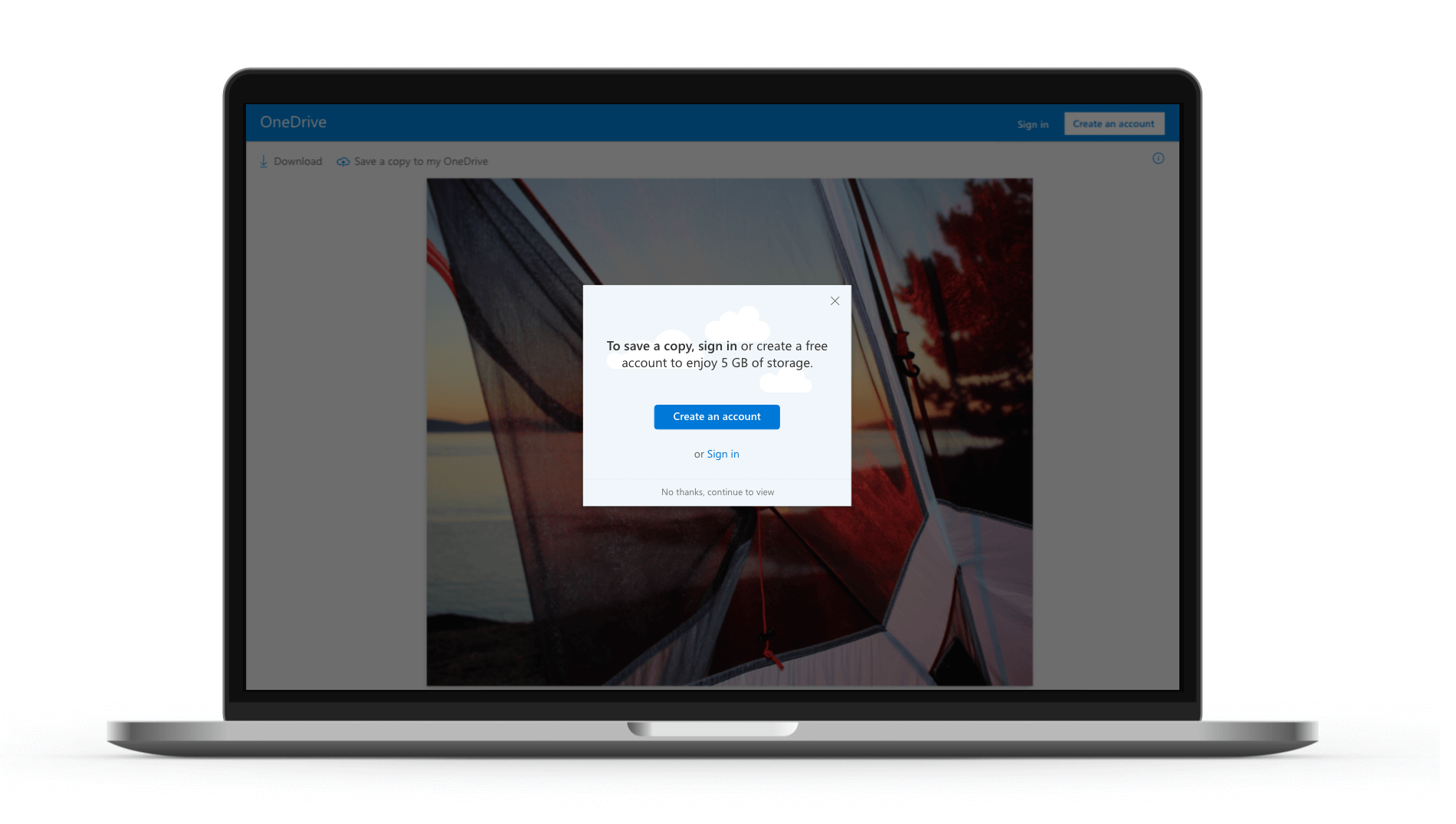
After the branding and commands were determined, the next part of the project was to encourage viewers further to sign in or create an account; I did this by creating a blocking dialog with text and options. When designing this dialog, I had four different approaches.
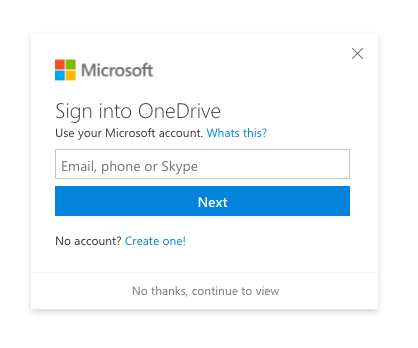
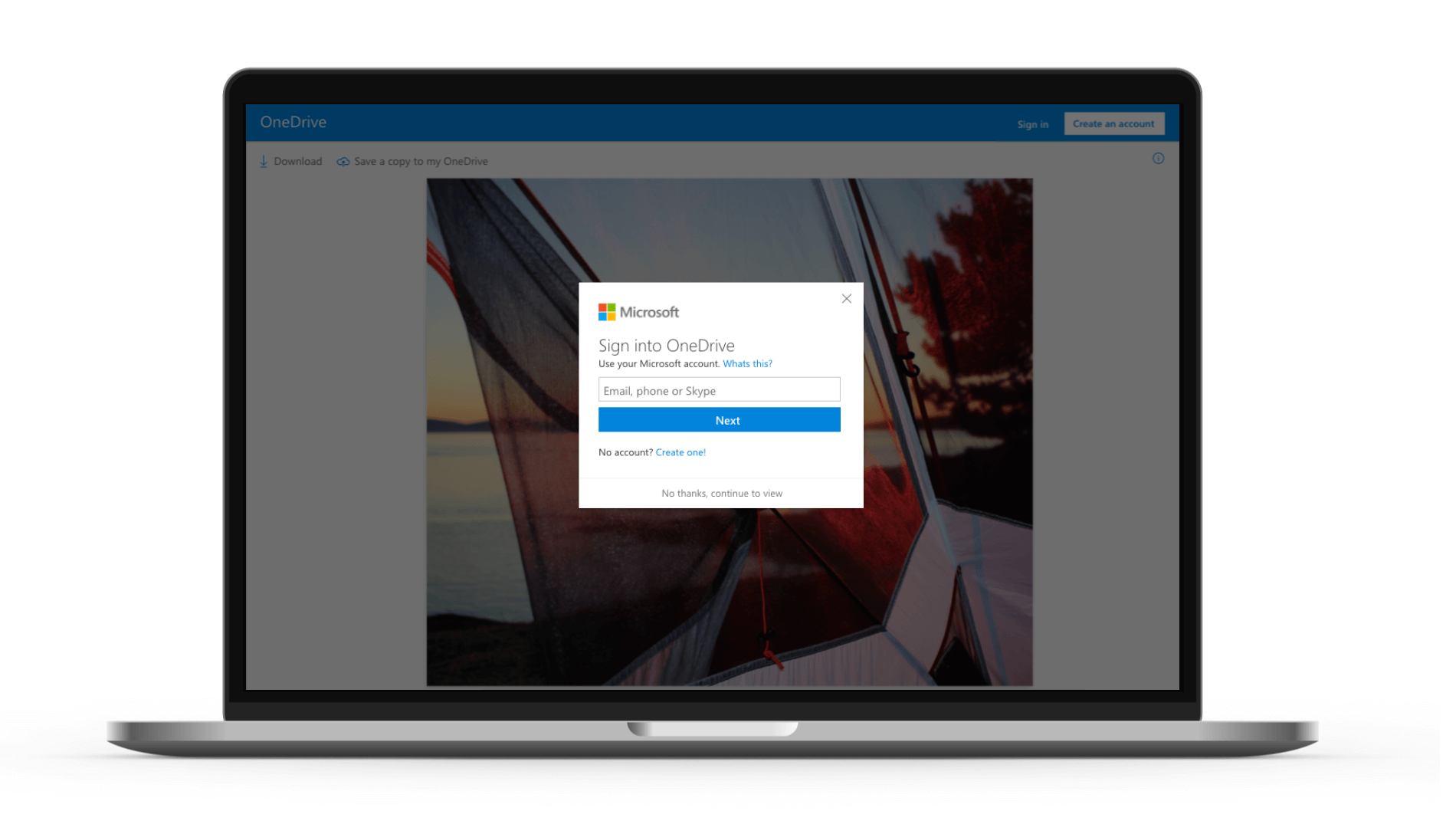
1st Design
The first was to create a sign in dialog mirroring the current Microsoft sign in. The thought here was to give the user confidence in the product by displaying a similar design as to what they are used to when signing into their account. I included 2 close buttons: an “X” in the top corner and a string at the bottom of the dialog so they would know that signing in or creating an account is only optional.
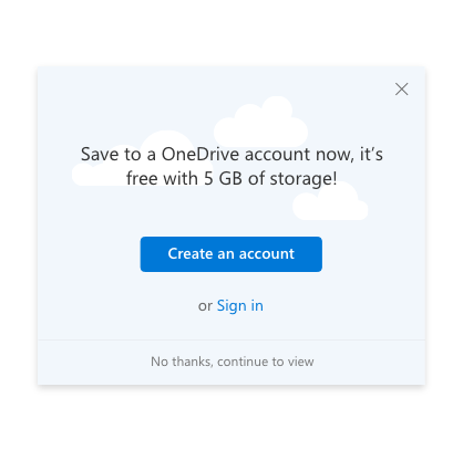
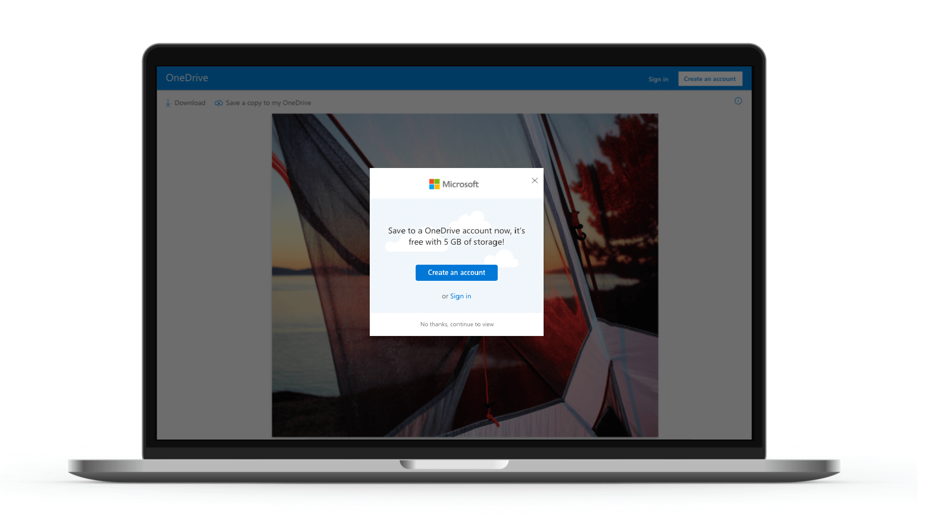
2nd Design
The second, third and fourth designs took a more fun approach and I included faint illustrative clouds in the background and a different layout than the standard Microsoft sign in dialogs. Also, the strings mentioned the value proposition of 5 GB free with a new account.
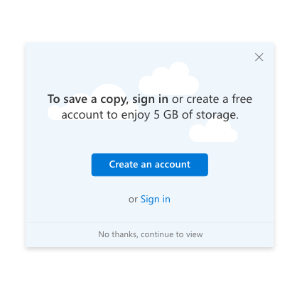
3rd Design
The third design leads with copy explaining the purpose of signing in or creating an account. Saving a copy of the shared file would allow the user to have their own version, in their own OneDrive.
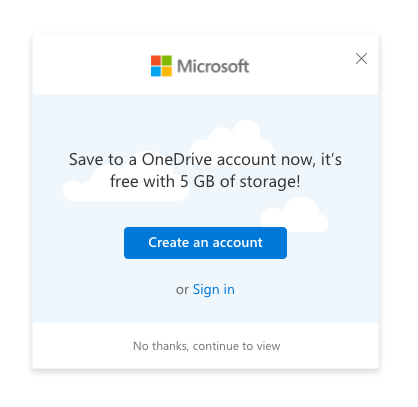
4th Design
The fourth approach used the same cloud design but included the Microsoft logo, to further reinforce the trustworthiness of the product.